Global_Warming_Predictions_Map.jpg


Summary

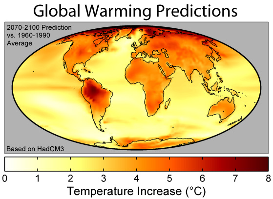
This figure shows the predicted distribution of temperature change due to global warming from Hadley Centre HadCM3 climate model [1] . These changes are based on the IS92a ("business as usual") projections of carbon dioxide and other greenhouse gas emissions during the next century, and essentially assume normal levels of economic growth and no significant steps are taken to combat global greenhouse gas emissions.
The plotted colors show predicted surface temperature changes expressed as the average prediction for 2070-2100 relative to the model's baseline temperatures in 1960-1990. The average change is 3.0° C , placing this model towards the low end of the Intergovernmental Panel on Climate Change 's 1.4-5.8°C predicted climate change from 1990 to 2100 [2] . As can be expected from their lower specific heat , continents warm more rapidly than the oceans in the model with an average of 4.2°C to 2.5°C respectively. The lowest predicted warming is 0.55°C south of South America , and the highest is 9.2°C in the Arctic Ocean (points exceeding 8°C are plotted as black).
This model is fairly homogeneuous except for strong warming around the Arctic Ocean related to melting sea ice and strong warming in South America related to predicted changes in the El Niño cycle and the possible collapse of the Amazon Rainforest . This pattern is not a universal feature of models, as other models can produce large variations in other regions (e.g. Africa and India) and less extreme changes in places like South America.
References
Copyright
This figure was prepared by Robert A. Rohde from publicly available data , and is incorporated into the Global Warming Art project.

|
Permission is granted to copy, distribute and/or modify this document under the terms of the GNU Free Documentation License , Version 1.2 or any later version published by the Free Software Foundation ; with no Invariant Sections, no Front-Cover Texts, and no Back-Cover Texts. A copy of the license is included in the section entitled GNU Free Documentation License . |
|
|
This file is licensed under the Creative Commons Attribution-Share Alike 3.0 Unported license. | |
|
||
| This licensing tag was added to this file as part of the GFDL licensing update . |